Choosing the Right Programming Font
Programmers and other IT professionals often customize their desktops to increase productivity. However, fonts often remains overlooked. Since you spend around 8-10 hours per day staring at a screen, it is an important choice. The right font increases legibility. That in turn helps battling eye fatigue and lowers the risk of typos (which can lead to nasty bugs). This article compares some of the most popular programming fonts.
Criteria for choosing a font
First of all, a programming font should be monospace. I don’t think this needs much explanation. The main reason is for structures in code to be aligned.
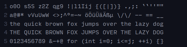
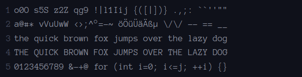
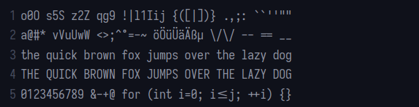
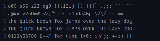
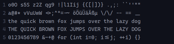
As mentioned above, the font should also be legible. Especially characters that are easily confused, such as lowercase l and uppercase I. To compare the various fonts, I am using a modified programming font test pattern from Martinus. It looks like this:
o0O s5S z2Z qg9 !|l1Iij {([|])} .,;: ``''""
a@#* vVuUwW <>;^°=-~ öÖüÜäÄßµ \/\/ -- == __
the quick brown fox jumps over the lazy dog
THE QUICK BROWN FOX JUMPS OVER THE LAZY DOG
0123456789 &-+@ for (int i=0; i<=j; ++i) {}
Last, but not least, you should consider the license. As more people use some mix of Linux, Windows and MacOS to do their work, I have picked only open-source fonts. You can easily get those on any OS. This disqualifies some popular choices, such as Consolas and Menlo.
Ubuntu Mono
The first entry in the list is Ubuntu Mono. It is a fairly popular choice, because it is the default on Ubuntu - by far the most popular Linux distribution.
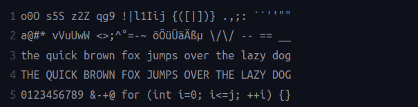
The characters are on the thinner side, saving you some screen real estate. The font not only looks good (personal opinion), but its legibility is great as well. The only problems I see, are the similarly looking g and 9 and the tiny ticks.
Source Code Pro
Source Code Pro is a sans-serif typeface created by Adobe. It is perhaps the most popular programming font that does not come as OS default.
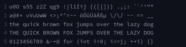
Compared the Ubuntu, the individual letters are wider. The distinction between g and 9 is very clear. Ticks are also larger and easily distinguishable.
Hack
Hack is a community-driven font base on Bitstream Vera. It is being actively developed and has out-of-the-box support for Powerline.
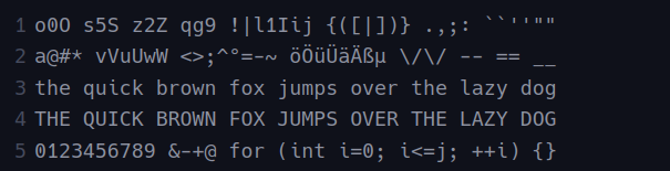
The size of the characters is similar to Source Code Pro, with slightly smaller letter-spacing. Lowercase g and number 9 are harder to distinguish. Ticks are slightly smaller, but retain visual clarity.
Inconsolata
Inconsolata was developed by Raph Levien. The main influence behind the font is Consolas (used in Windows).
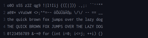
It has has the thinnest letters from all the fonts included in the list. Use it to save some screen real estate. However, I could easily imagine some people confusing braces and parentheses while using Inconsolata.
Input Mono
Input was created by David Jonathan Ross. Like Hack, it also supports Powerline out-of-the-box. Unlike other fonts on the list, it also includes proportional fonts designed for coding.
The characters are truly massive, larger then any other typeface in the selection. Despite their size, backticks and regular ticks look somewhat similar. Personally, I also find the braces visually busy.
Anonymous Pro
Anonymous Pro is a typeface family developed by Mark Simonson in 2009.
The letters quite light, similar in size to Inconsolata. Anonymous Pro retains good readability at smaller sizes, thanks to having bitmaps for those. However, the legibility is not the best - lowercase g and number 9 are quite similar, same goes for lowercase l and uppercase I and braces and brackets. I also don’t find dashes and underscores to be distinct enough.
Iosevka
Iosevka is one of the two fonts on the list that feature ligatures, the other being Fira Code. It puts emphasis on compatibility with CJK characters.
The individual characters are very thin and tall, which might a pro or con, based on who you ask. Lowercase g and number 9 could be more distinct. The same goes for dashes and underscores. Otherwise, the visual clarity is fine. The ligatures are very elegant.
Fira Code
Fira Code is another featured font with ligatures. It has been developed by Mozilla.
All characters have good visual clarity. But I don’t see a reason to have lowercase r as serif. On top of that, the ligatures do not look as good as the Iosevka ones.
Cascadia Code
Cascadia is new default monospace font developed by Microsoft. Unlike their previous creation, Consolas, it is open-source. It supports ligatures, as well as Powerline characters.
The characters are perfectly legible. Similarly to Fira Code, the serif on lowercase r seems unnecessary. There is a missing ligature on double equals mark, but otherwise, they look very good.
Conclusion
Did you find your favorite? If not, consider checking out other typefaces on Dev Fonts (which is where the snippets come from). As for myself, being ambivalent about ligatures in programming, I will stick with Source Code Pro. My new favorite is Cascadia. Iam just unsure, whether to use the variant with ligatures, or the plain one.